This page shows and details the various logos used by Mountain Dew over the years from its debut to present day. To see all logo images on the Wiki, see Category:Logos.
1940's - 1969 Logo


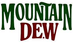
The original Mountain Dew logo. Used from the beginning on glass bottles all the way until the 1969, when it was retired. It has recently made a comeback on Throwback's current packaging.
1969 - 1996 Logo
Found on packaging as 1969, this retro-style logo (and multiple variations of it) was used all the way until the mid 90's. Throwback used this logo in its first release and the Malt Flavor Johnson City Gold from the regional Dew promotion used this as a few Green Label art aluminum bottles and as well as special glass bottles of the drink.
1969 - 1980 variation
This logo version had a pointed “D”, called the “Wave”, which was later removed. This logo ran for about 11 years before it was modified..
1980 - 1996 variation
This version of the logo was the same as before but the pointed “D” was changed. This logo ran for about 16 years until it was replaced. In 1991, it was made thinner and taller.
1979 - 1980 Test Logo
This logo is seldom seen and could have been conceptualized about the same time as the “Reach for the Sun, Reach for Mountain Dew” or “Taste the Sunshine” campaigns.
1996 - 1999 Logo


Found on packaging from as early as 1996 to as late as 1999, this logo served as somewhat of a bridge between the previous and the next. This logo only ran for about 4 years, making it the shortest running logo (that wasn’t a test logo or limited run).
1990's Eurasian logo
In the 1990's, Mountain Dew products in Asia began using this logo, which had a completely different typeface than the U.S. logo and was surrounded by "WILD COLOUR" and "SMOOTH TASTE". Also, when Mountain Dew was released in the United Kingdom in 1996, it used this logo, which was used all the way up until it was discontinued in those countries due to low sales.
1991 "Vintage" logo

In 1991, some Mountain Dew cans began using this logo, which had a different typeface and as well as a banner below the logo reading "THE ORIGINAL". This logo was also used on Diet packaging and was discontinued a year later. Also, this logo was released in Japan and Dry Ginger used a variation of this logo when it was released in there in 1990.
1999 - 2005 Logo
This logo premiered in the 1999, and lasted until 2005. During this time, Code Red, Live Wire, Pitch Black, Baja Blast, and Blue Shock Freeze all entered the market, and thus used variations of this logo.
2005 - 2009 Logo


In 2005, this logo began appearing on packaging, with the words: "Same Dew, New View." All pre-existing flavor variants used their own version of this logo and all new flavors would use it until 2009. It can still be found on packaging for older flavors while they are still in transition, and on all packaging outside the U.S. and Canada.
2009 - Present Logo
This is the current logo, which premiered in 2009 on the regular and Diet packaging. All new flavors (except Throwback) after this transition use this logo starting with the 2009 WoW Game Fuel flavors and as well as Diet Ultra Violet. Starting in 2017, while the same logo was used, the background on bottles, cans and 12 pack boxes was changed from dark green mountains to a more brightly colored abstract variety of greens and black which is similar to the one used on many European cans.
2009 Prototype Logo


This was the prototype logo for Mountain Dew, which premiered in 2009. Images began spreading of bottle designs for Regular Mountain Dew, Diet Mountain Dew, and Mountain Dew Voltage using this logo but it was not well received, because it somehow looked more like a generic brand. It was only available in Chicago.
Canadian Logo
With the rebranding of the Mountain Dew line in Canada beginning in February 2012, this logo was specially designed to be used on its packaging. It is based directly off the current logo used in the United States, but the word "Mountain" is not abbreviated. In January 2017, Mountain Dew Canada announced that they would be rebranding to the American logo, similar to how European countries changed to the Canadian one.
European Logo


In 2016, the United Kingdom, Greece, Romania, Finland, The Netherlands, Spain, Morocco, Thailand and South Africa have switched to this logo which is similar to the Canadian logo, but a little different.
Flavor Variant Logos (2009 - Present)
")
")
")
")
Fanmade Logos
")
")
")